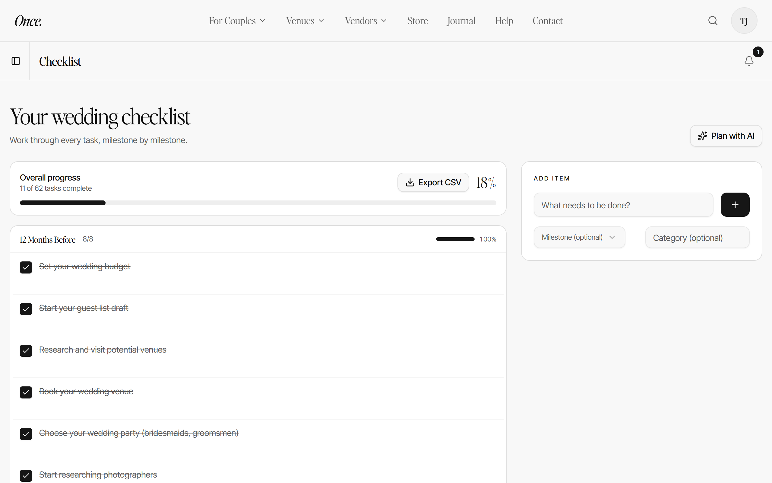
01 Checklist
Simplify your to do list.
- Design your day on a custom template.
- Tick off and delegate tasks, one by one.
Launching soon
South Africa’s wedding planning platform you'll only need once.
Find your venue and vendors, design your wedding website, book a digital wedding camera and take the stress out of planning with tools you'll actually use.
Join the list and be first to demo the platform.
The Journal features real local weddings, the suppliers behind them and what they actually cost, including tips and tricks.
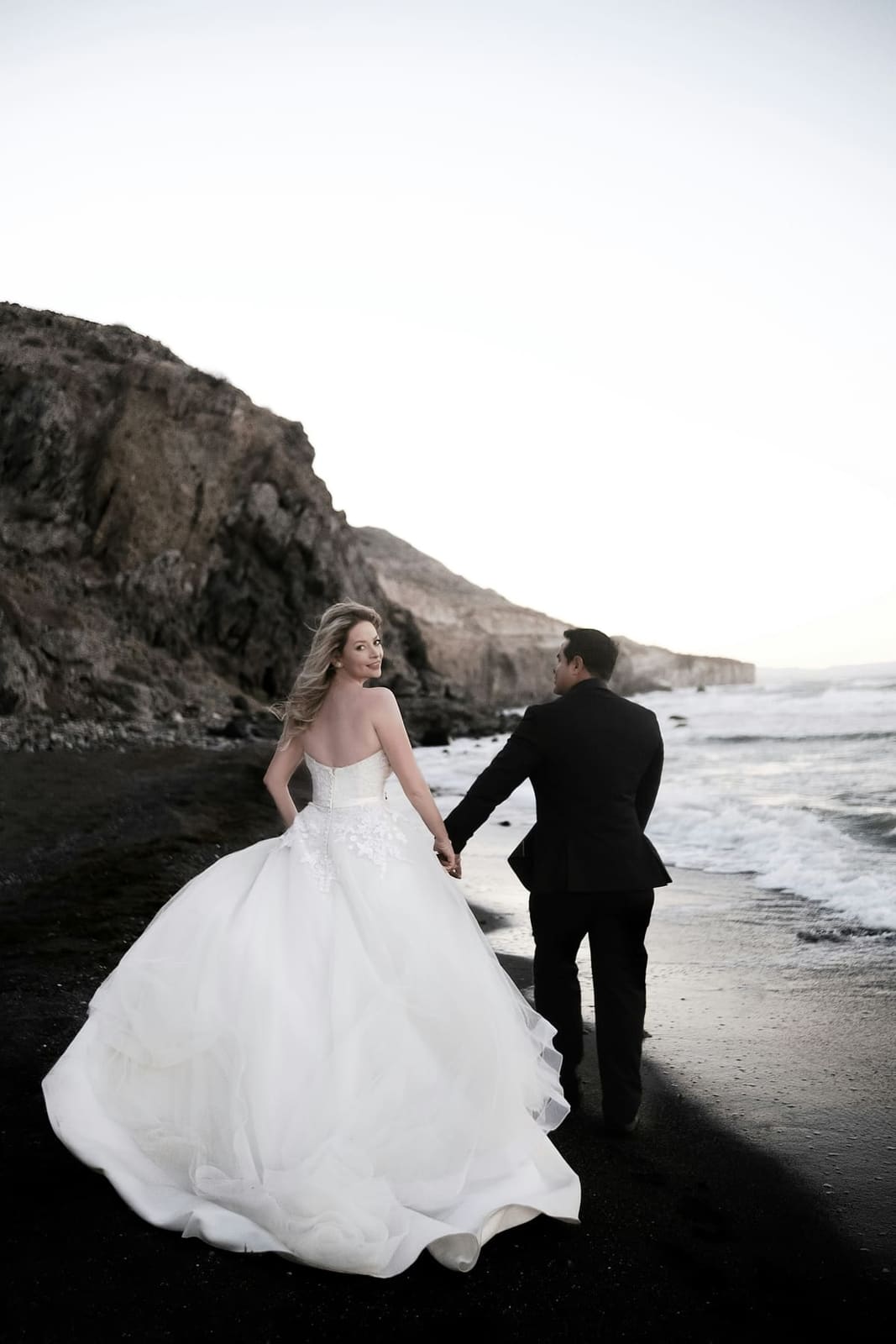
Premium planning tools
Make the unglamorous part of a wedding easy.
01 Checklist
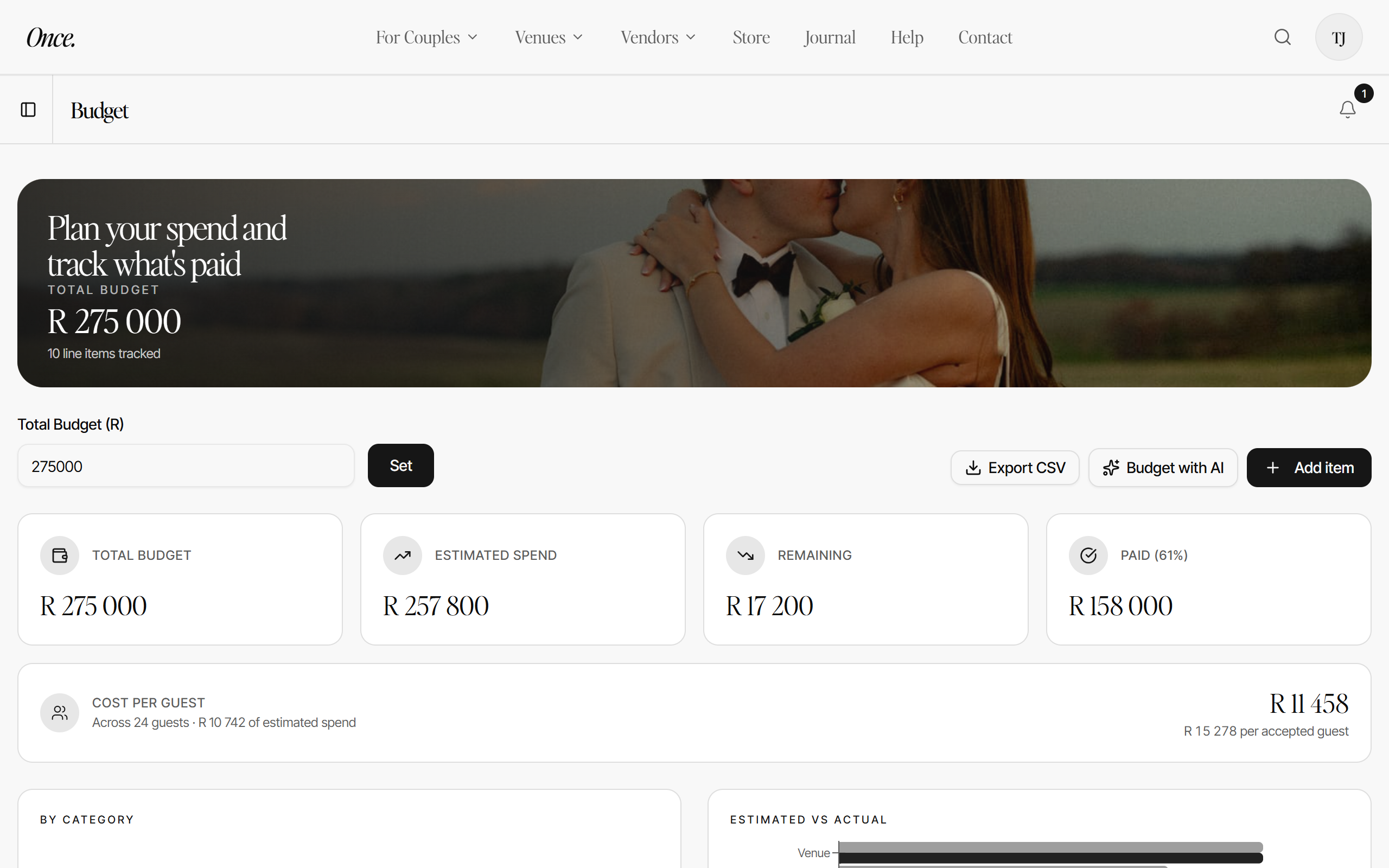
02 Budget
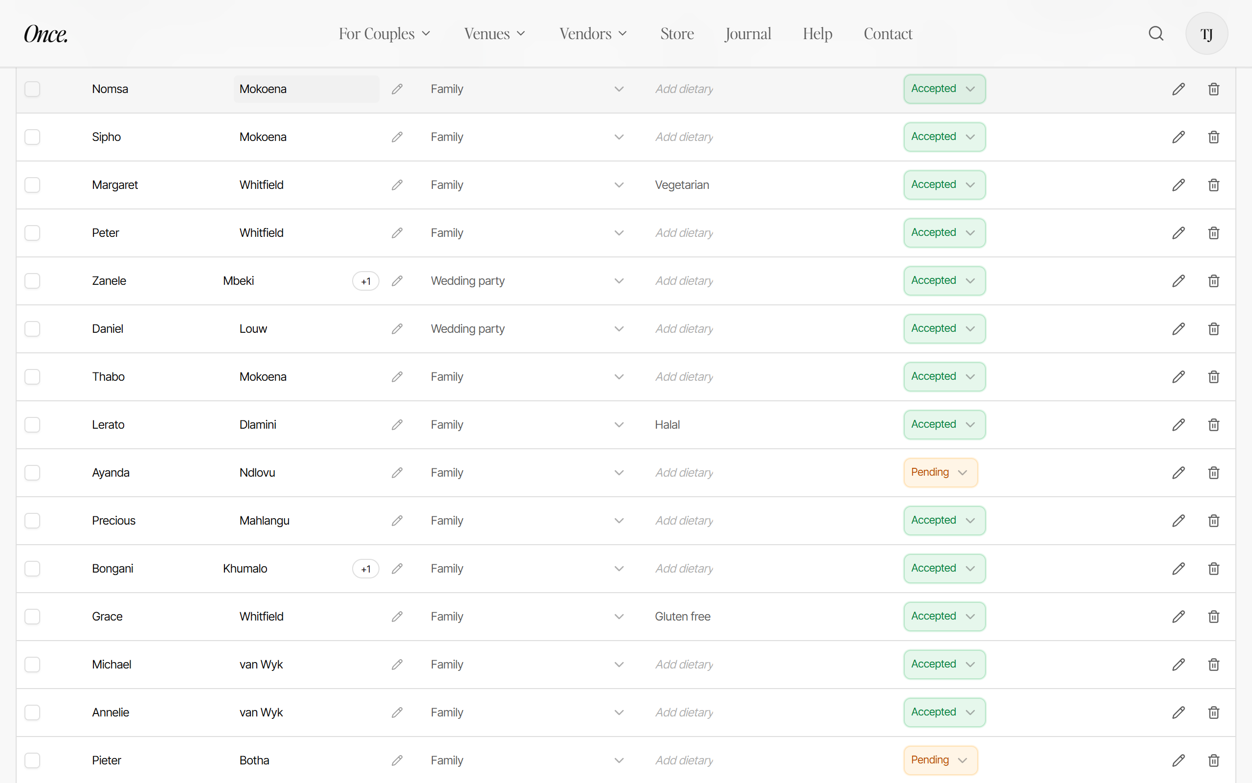
03 Guests
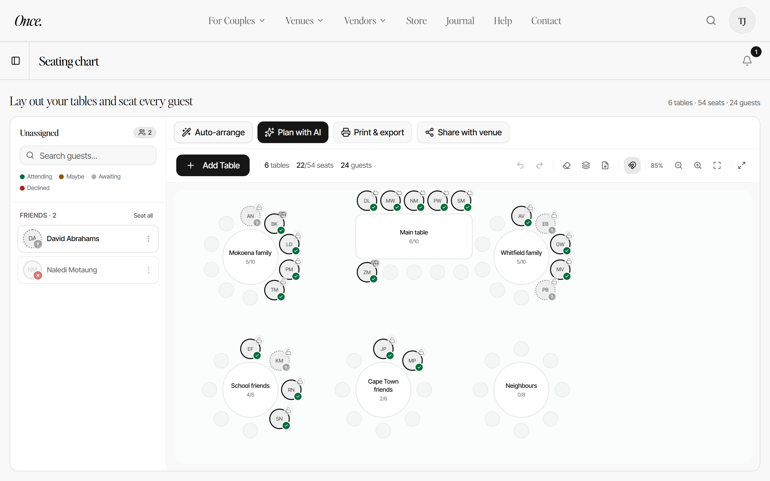
04 Seating
Every task by milestone, checked as you go.
Estimates, payments and what is left, live.
Accepted, pending and declined at a glance.
Move a table, drop a guest, done.
Inspiration
Gather every idea in one place, then arrange your whole day the way you see it in your head.
Browse thousands of ideas
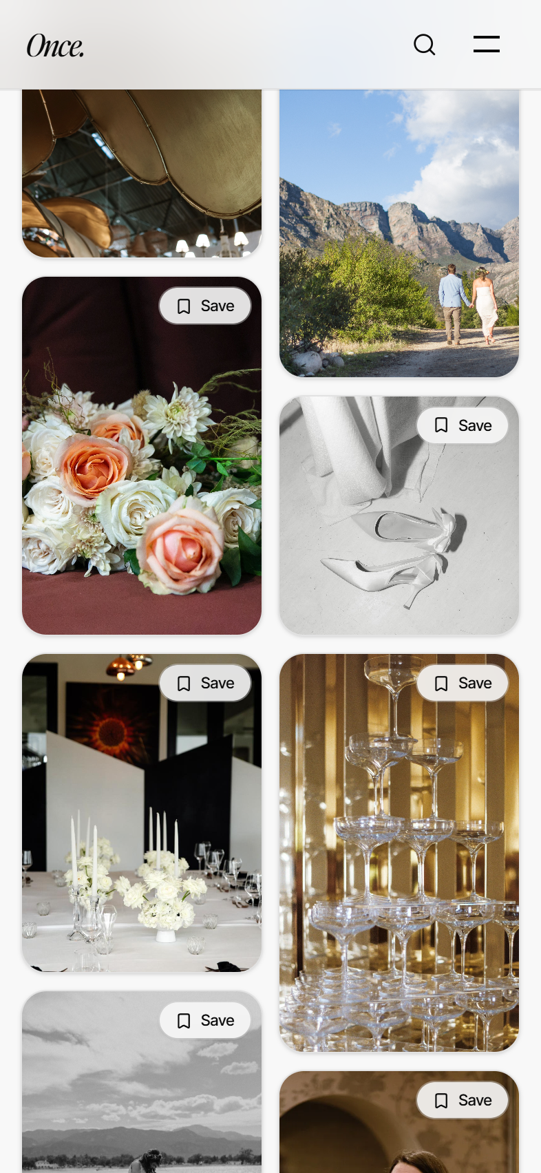
A living feed of real South African weddings, venues and suppliers. Search it, filter it, fall for it.
Save what you love to boards
Tap Save on any photo, a cake, a bouquet, a ceremony arch, and keep it in a board of your own.
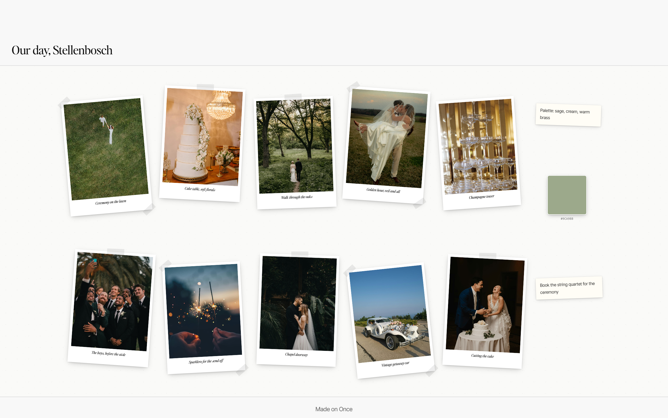
Arrange it on an infinite canvas
Pull your saves onto a freeform mood board: pin photos, add notes and a colour palette, then share the whole vision.
Gifts and cash contributions your guests can give in two taps.
Your wedding website
Tell your story, include useful details, directions and RSVPs and go live in minutes. Premium invitation experiences your guests open like a gift.
Start for free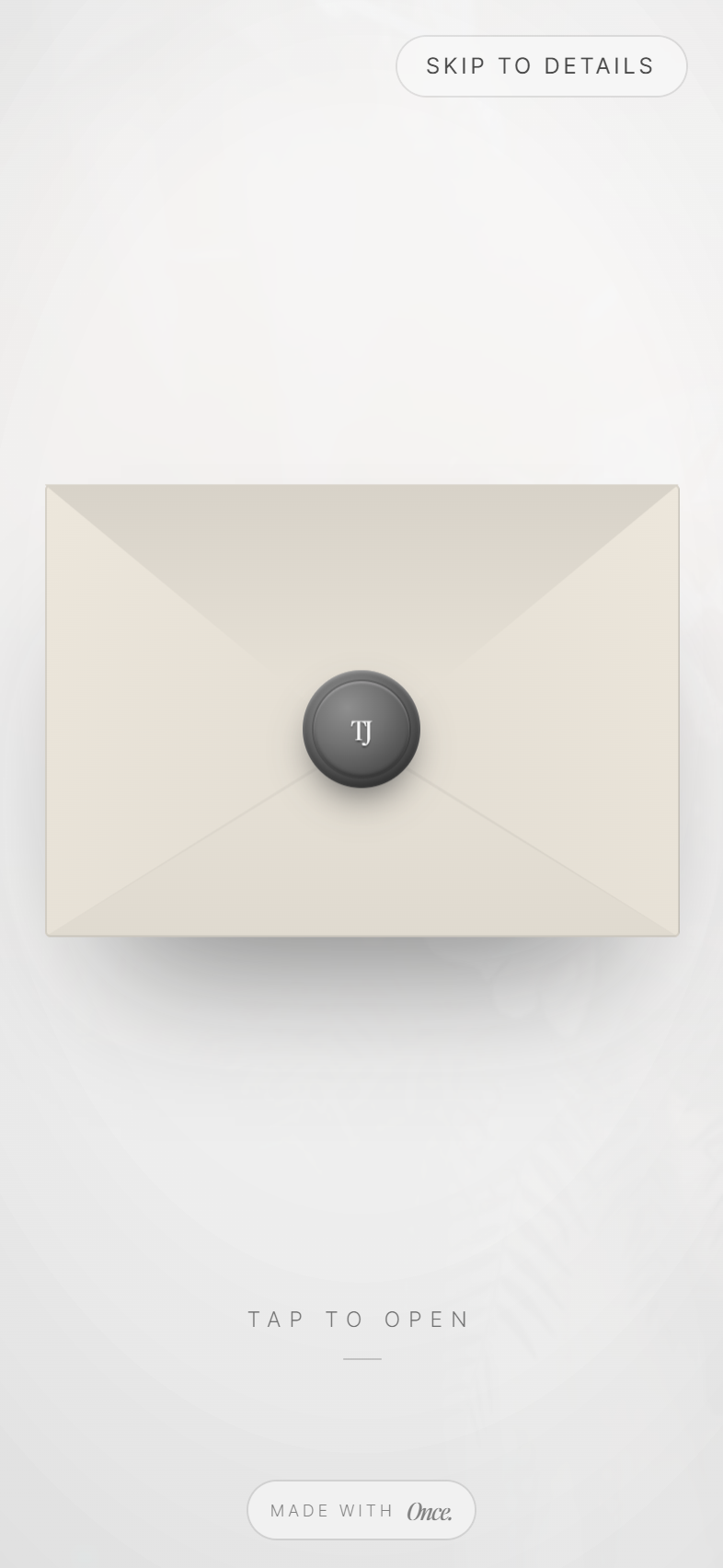
Once Memories
Guests scan one code and shoot on a shared film. No app to download. No chasing anyone for photos afterwards. All shot on the same filter and revealed on a date of your choosing.
The roll stays locked until the film develops.
01Scan
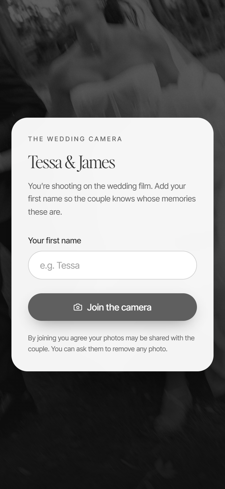
Guest scan the code at their table. No app to download.
02Shoot
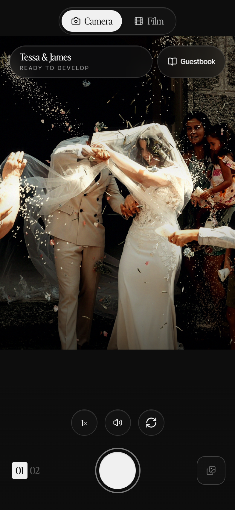
Everyone shoots on the same shared film through the day.
03Develops
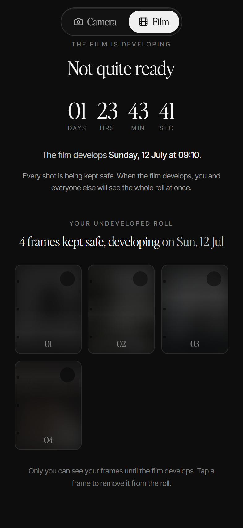
The roll stays locked, then develops into one album after the day.
One album of every guest’s photos, and a guestbook they sign as they shoot. Starting from R249.
The directory
A handpicked supplier directory, from exclusive wedding venues to photographers worth booking.
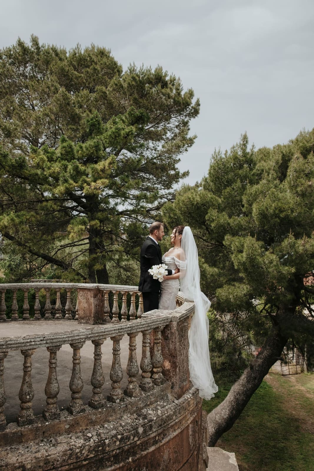
Wine farms, gardens, forests, the coast.
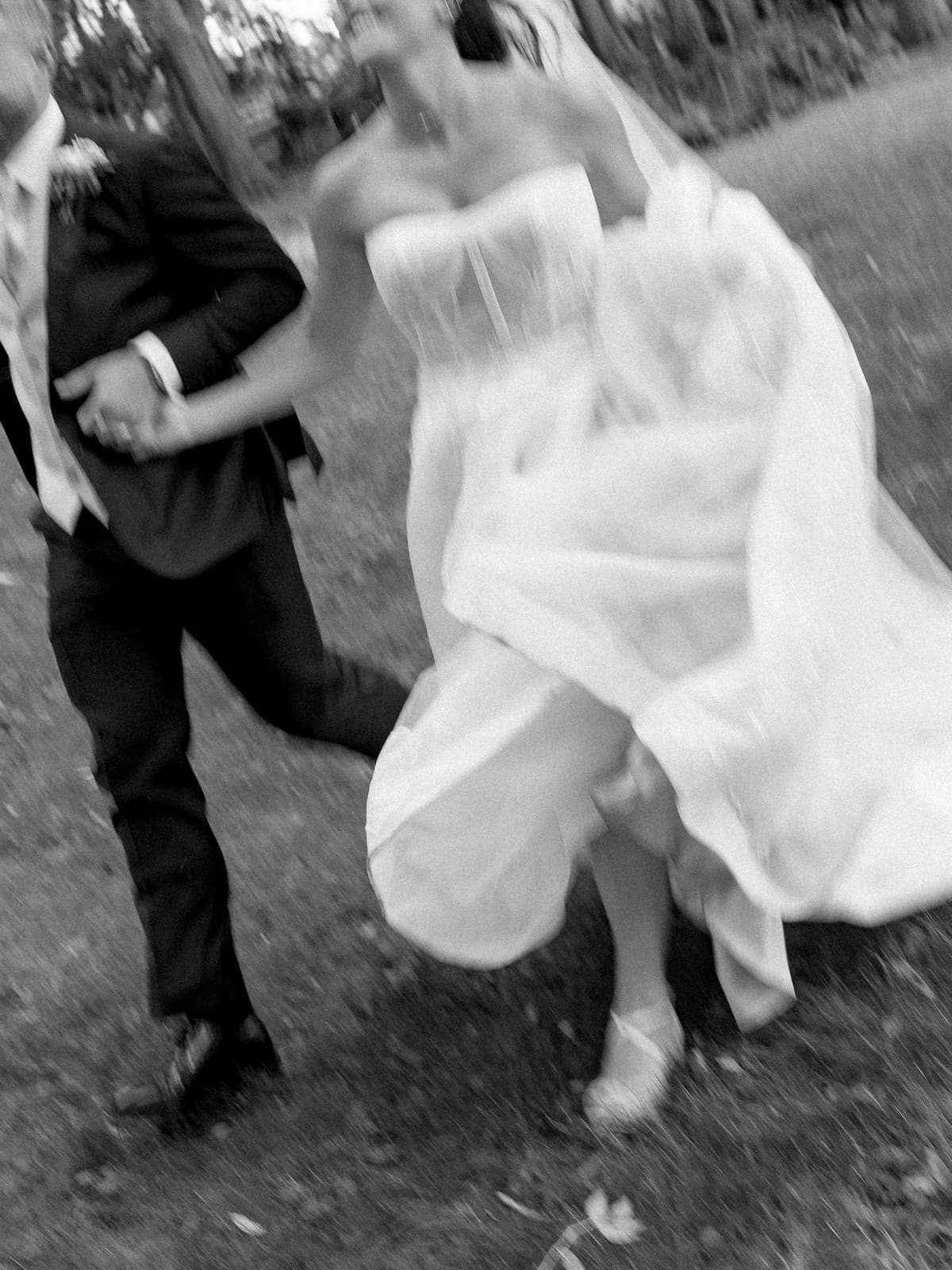
The ones who catch the in-between.
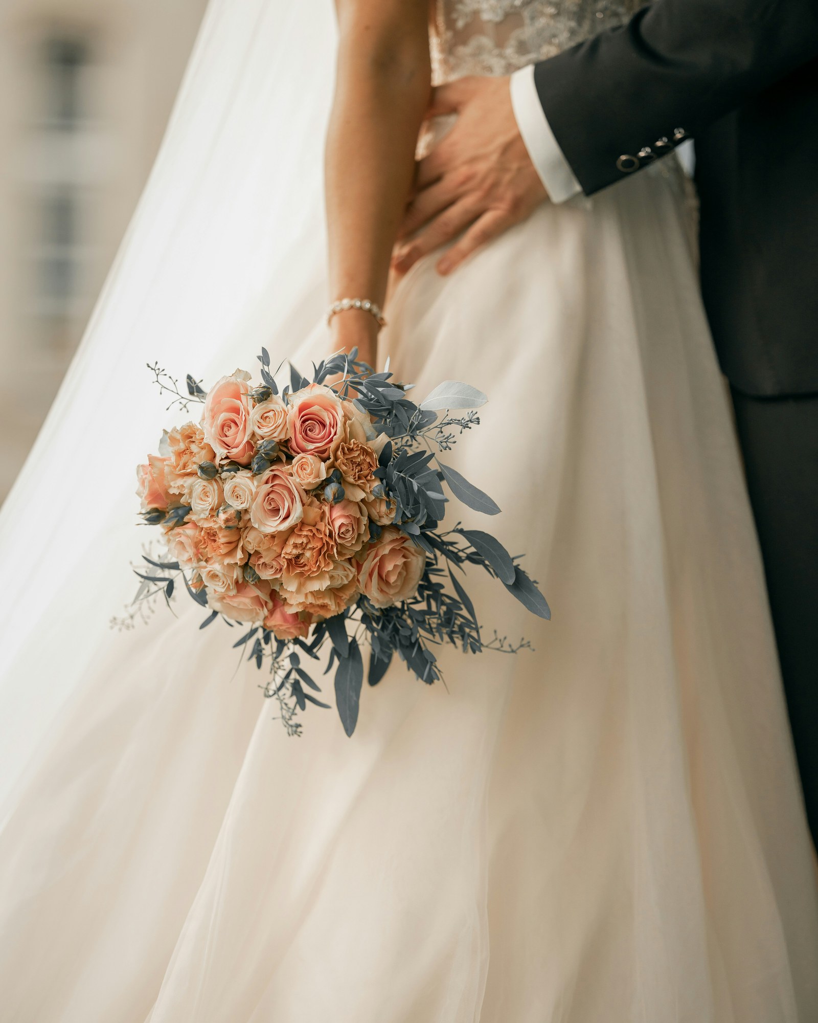
Transform your day.
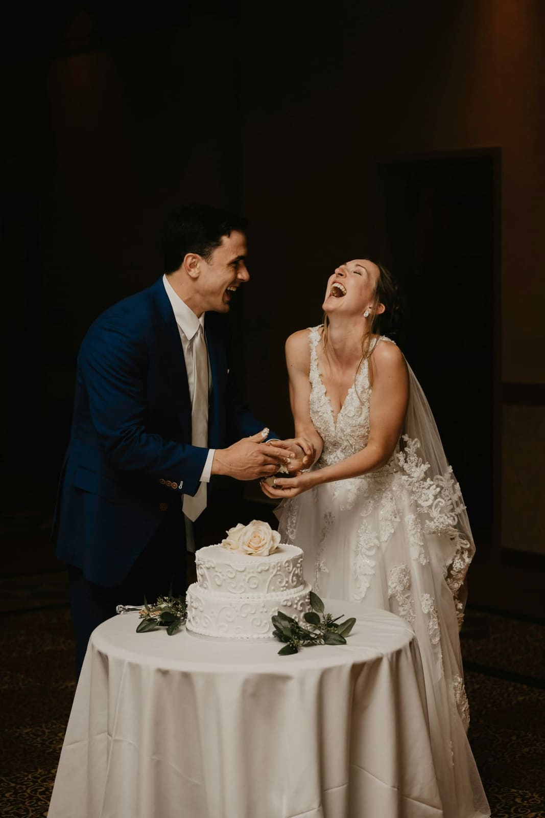
Love is the main ingredient.

The dance floor, sorted.

Hair and makeup that lasts the day.
The Once Store
Coming soonA curated store of wedding products made by South African suppliers and makers we have chosen ourselves: stationery, décor, favours and gifts. Shop them all in one place, and every order is tracked alongside the rest of your planning.
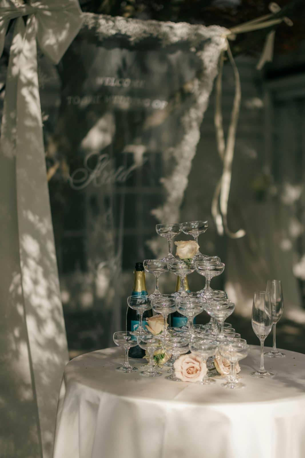
Invitations, menus and the on-the-day paper suite
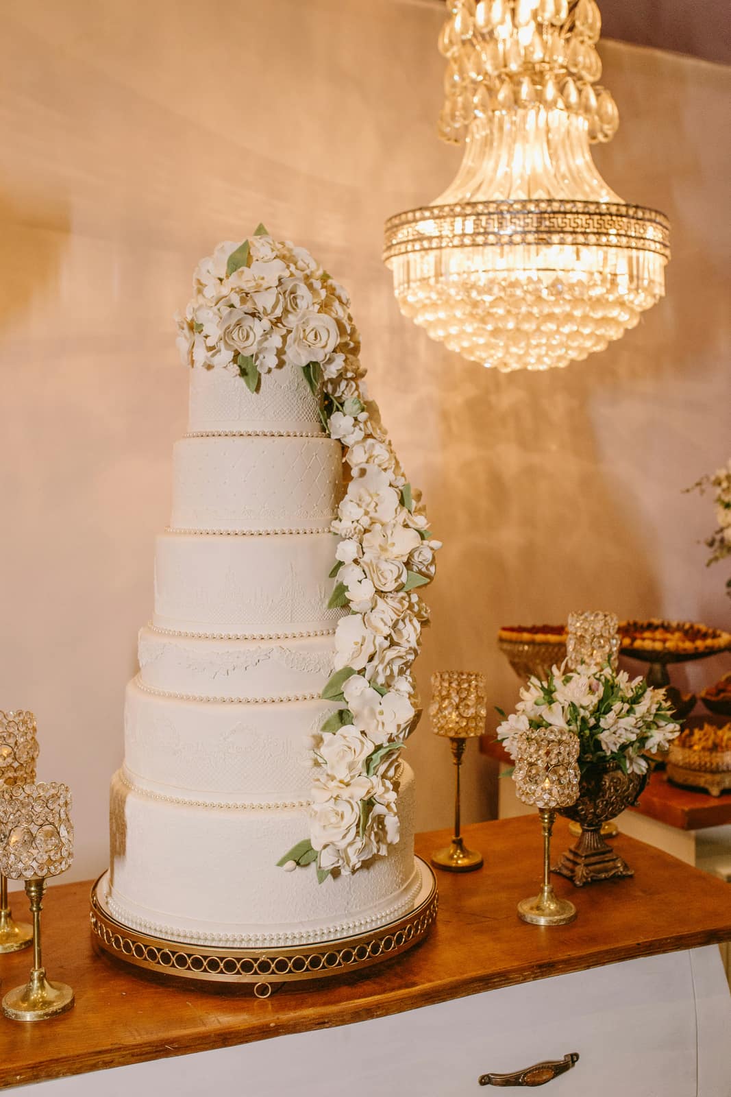
Table styling, signage and the finishing details

Small thank-yous for every place setting
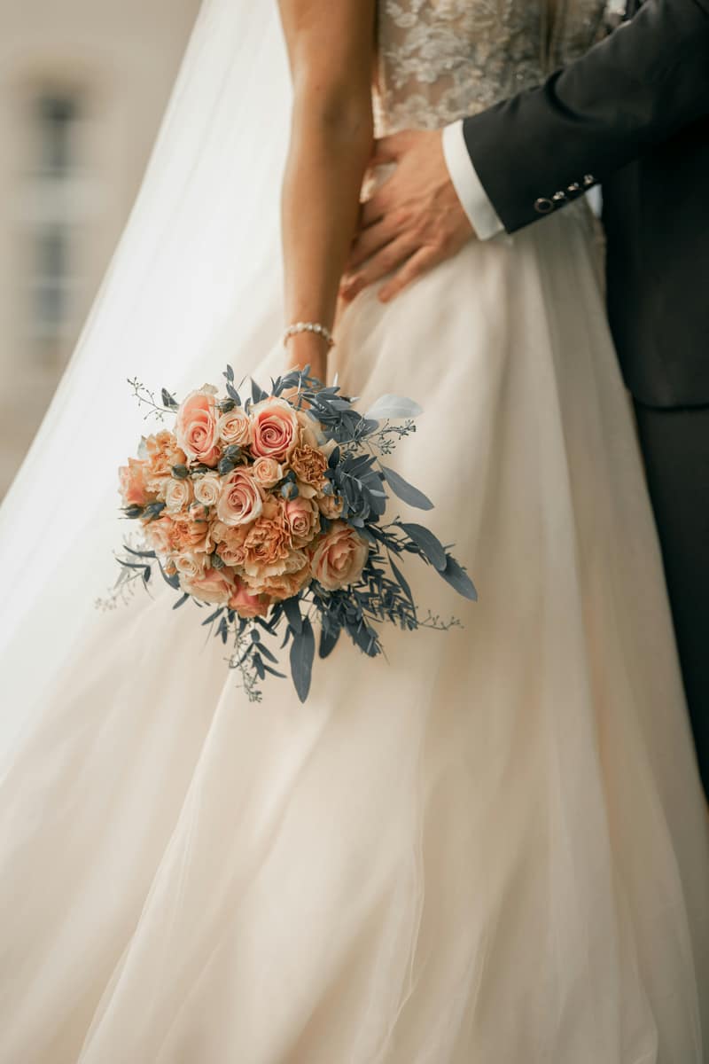
For the wedding party and the people who made it
Join the list as a venue or vendor and we will be in touch to get you live.
Start planning your once in a lifetime wedding day.
Start for free.